
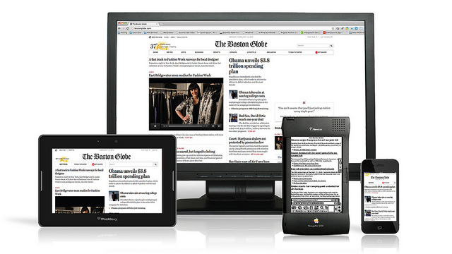
In the early days of the internet, online marketing and web design were a lot simpler. Before smartphones, tablets, and massive variations of screen sizes and resolutions, websites could be programmed in one static way. Now things have changed. Your medical organization’s online presence is more important than ever and the factors that go into your web marketing strategy have multiplied exponentially. Now at least 58% of adults own a smartphone, and 42% own a tablet. Thirty-four percent of smart phone users use their phones mostly for browsing online, in place of a traditional desktop or laptop. This brings us to the most used word when it comes to modern web design: responsive.
One Site Fits All
When smartphones first started to gain popularity the first movement to catch these mobile users was the “mobile site” approach. You would have two websites, one for desktop and laptop users, one for smart phone users. This approach runs leads to quite a few headaches. Mobile site redirection requires the use of a database of devices that needs to be continually updated so that it can detect and redirect those devices to the mobile website. Not only is setting up this database a pain in the rear, so is keeping the database current. On top of that, there are several SEO problems you can run into if the proper coding isn’t set up to avoid duplicate content and a number of other potential technical problems. Lastly, it’s just another website you have to keep up to date which means more work. Wouldn’t it just be simpler to have a “one site fits all” approach?
That’s where responsive design was born. Separate mobile websites have all but been phased out and it is clear that for SEO purposes, that is how search engines prefer it as well. (Of course having a mobile site is still better than only having a static site.) Responsive web design cuts out the “middle man” so to speak with one one-size-fits-all website. With responsive design, your medical organization website design in Mesa will scale to fit any screen or resolution, giving users the optimal experience on any device. This means you only have to make edits to one website, avoid the technical hoops of mobile redirection, and the site will already be ready to scale for whatever new device comes out next. Responsive web design is all about adaptability.
There are a few initial drawbacks to responsive web design. If you like your current medical organization website design, responsive coding is not something you can simply stick into a website and make work. It generally requires a ground-up design approach on a CMS platform or custom programming. A mobile website might be more in your wheelhouse if you are stubbornly set on keeping your current website just the way it is, but redesigning your website now can save you quite a few headaches down the road.
Images used under creative commons license – commercial use (11/12/2015) Antoine Lefeuvre (Flickr)