If you’ve been alive for any amount of time since 1977, you’ve at least heard of the Star Wars franchise. The latest film recently came out, Episode VII – The Force Awakens, as I’m sure your are aware. Many fans of the originals would probably agree that one of the biggest follies of the recent 3 prequel films before the newest installment was their reliance on computer graphics and animation. The original films were a marvel of practical effects, puppets and movie makeup. Where the newest movie triumphed was it’s flawless blend of both modern CG and classic practical effects – resulting in a film that felt much more true to the originals.
Like Star Wars, web design is undergoing a sort of merging of the old and the new. Many aspects of web design that were around in the Internet’s hay day are making a comeback and are being incorporated in new ways and blended seamlessly back into modern web design. Below are a few examples of that.
Revenge of The Gif
The early use of gifs online was comical at best. Websites were often packed full of flashing icons that just moved back and forth like little Nintendo characters. These file types have come a long way and can be found and shared on popular sites like Tumblr, Giphy and now Facebook. Larger scale gifs in the form of cinemagraphs like the one above are now being incorporated into modern web design to add subtle movement into background images, create smaller silent video loops, etc.
The Fonts Strike Back
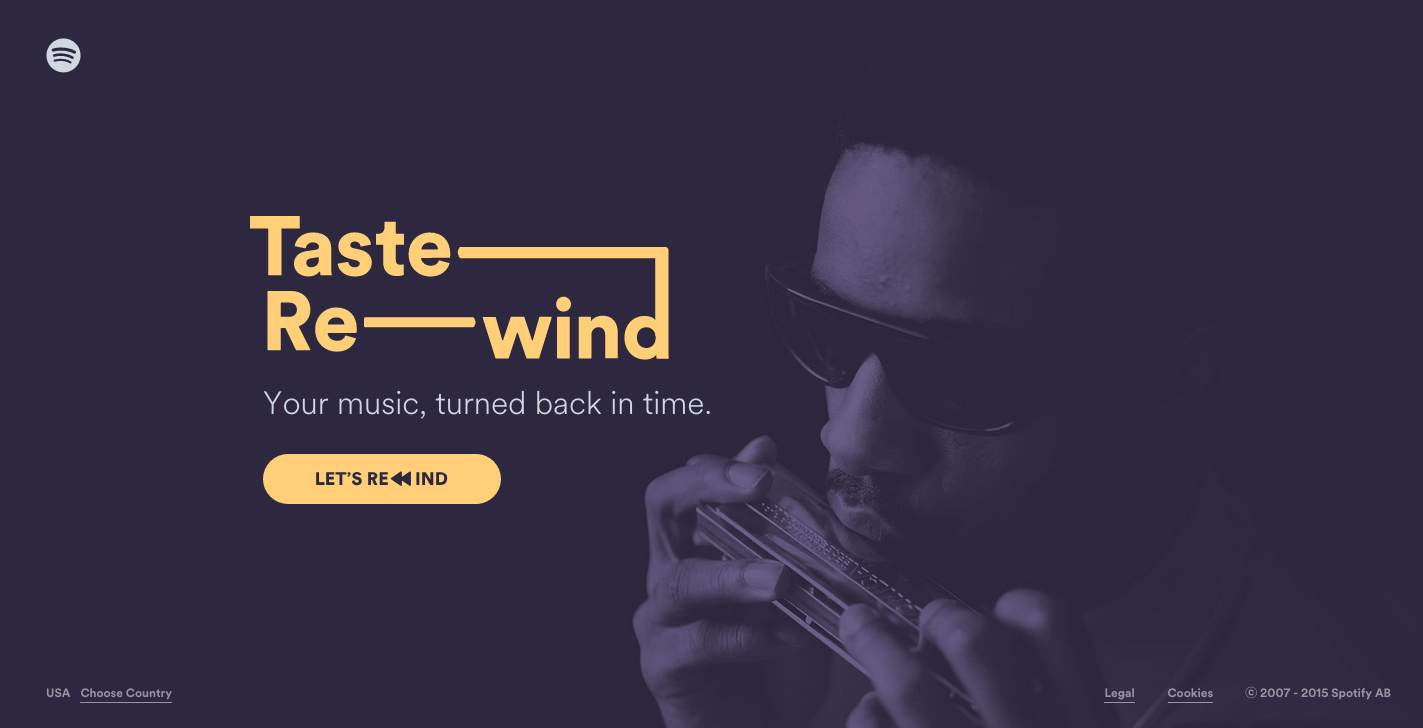
Back when there were very few tools available to make your website stand out, the use of different fonts was a way to add some variation of you website (but let’s be honest, Comic Sans always looked terrible). Now, with the return of more bare bones minimalist websites, a lot of attention is being payed to typography and font use. So much can be said just by your font choice, and now with tools like Google Fonts, there are so many more options at your designer’s fingertips!

Photo Source: http://spotify-tasterewind.com/
Return of the Vibrant
Until recently, bright, vivid colors were generally reserved for artist portfolio websites and other “non-professional” sites. However, like the early days of the internet, bright colors are making a comeback. Sometimes they are just to punctuate minimalist white-space heavy sites, others still utilize minimalism but draw the eye with vivid backgrounds and gradients leading the eye straight to your bold call to action. Unlike the early days of the internet, high definition displays are allowing the use of colors beyond the traditional 216 web-safe colors. The color options now are in the millions!
Contact New Wine Web Design today to discuss what design trends or features you’d like to see on your website!
