There are times when our clients may have a difficult time explaining exactly what their vision is for their new project, whether it be a website, a logo or some other form of content. One area that we often see communication struggles is with typefaces. Commonly referred to as “fonts” typefaces are a particular design of type (think font-family). They include: Helvetica, Futura, Times New Roman, etc. In order to help you communicate your ideas more effectively, we thought we would create a short guide on the most common styles of typefaces and when they may be most appropriately used.
Serifs
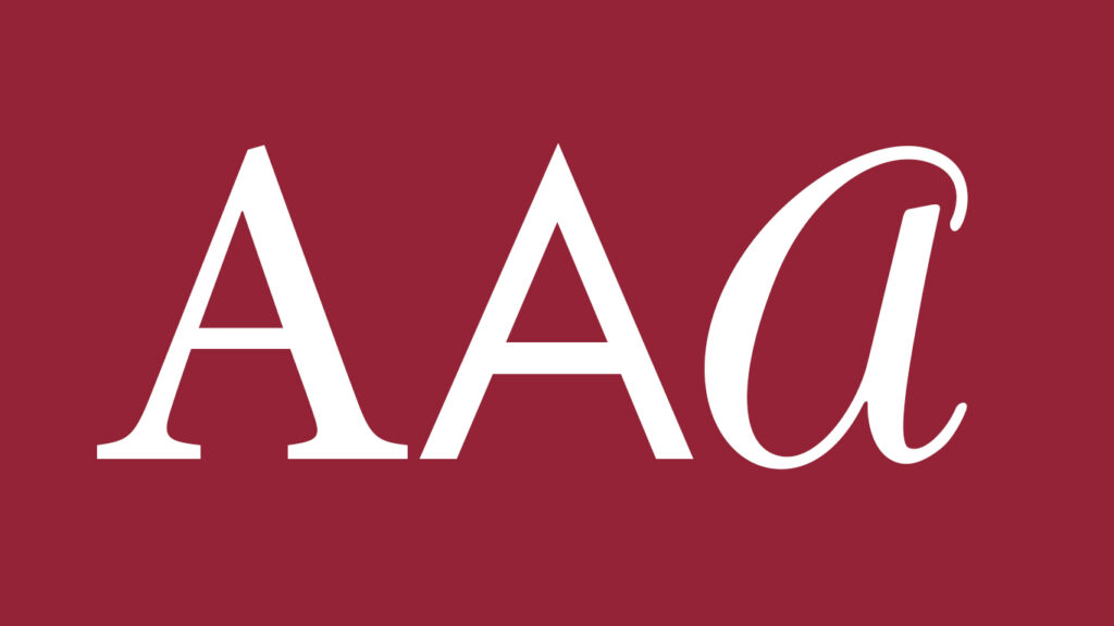
Serifs are extensions found at the end of letterforms. An example of a serif would be the bottom of the first “A” in our header image for this article. The “legs” of the A extend out as if they were given feet for balance.
Serifs have a wide range of styles and uses, the same can be said for each of the typeface categories listed here.
When should they be used?
Serif typefaces tend to express a more classic, scholarly, and/or timeless feel. They give off a “smarter” impression and denote brands who value professionalism. A company that uses serif typefaces may come across as safe and reliable though you may also see brands who push these typefaces in ways that make them edgy and modern. We see this often in fashion brands, for example, who may use very thin and elegant serif typefaces.
Sans Serifs
Sans simply means “without.” That makes this style easy to remember as it is a typeface without serifs. The second A in our header image is an example of this as it is missing the extensions of the first, serif A.
When should they be used?
Sans serif typefaces tend to give a more modern and youthful feel when compared to sans serif typefaces. This also happens to make sense chronologically as well, since sans serif styles were developed after serif styles. Brands that use these fonts come across as more friendly, relatable, and even fun. They pair great with companies who want to appeal to trendy, younger crowds but also for companies who want customers to feel a sense of comfort and ease with their brand.
Scripts
Scripts imitate handwritten letterforms. Because of this, they can come across as anything from formal to cool and even bizarre. The more formal types of scripts tend to involve cursive letterforms which give off a feeling of classical elegance. Informal styles can bring a more edgy or casual feel.
When should they be used?
Due to their funky and unique style, scripts are not as commonly used as serifs or sans serifs and they usually fill a more niche role. For example, they tend to be used for weddings or other events to give their invitations a more personal touch.
We know you’re excited to begin your next project, and we hope this guide to typefaces may have been helpful as you aim to communicate exactly what you envision. At New Wine Digital, we offer a range of services from website design to logos and more. Contact us today for an inquiry into how we can help your business and your vision grow. We look forward to hearing from you!
